
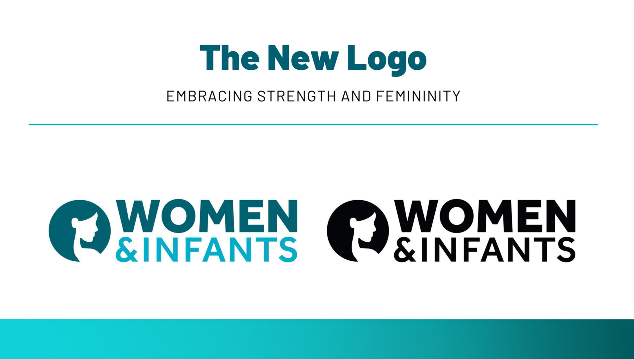
Women & Infants Brand Refresh
As the region's leading women’s specialty care hospital, supporting the majority of birthing persons in the state with over 85% of all Rhode Island babies born there, W&I has been an institution to the state of RI since its inception in 1884. Now, as the 9th largest stand-alone obstetrical service in the country, it was time to modernize both logo and brand identity to better connect with our patients.
In rebranding Women & Infants, our goal was to ultimately shift our perception in the marketplace from singularly focused to multidimensional, realigning our positioning to connect with more patients across generations. We want to ensure that all women feel seen, heard, and represented. To connect with those who identify as female, we also needed a tagline that can speak to the collective whole and bring us into the next phase of our identity.

The Tagline
Our team looked hard at who we were and where we wanted to go as a brand. We knew we needed a tagline that spoke to all in that work. Something that was as timeless as it was statement-making to capture the essence of the hospital that is more than just a birthing center. It’s where you go when you need the best in specialty care services. For wellness. For strength. Cancer care and family planning.
It is the story of every person who walks through that door, whether that begins with bringing new life into this world or starting your journey for safe, comprehensive care.


Award-Winning Results
Role: creative & art director, creative process supervision and facilitation, team guidance, market research, stakeholder pitch and buy-in to secure funding, visual consistency, media buy and placement for launch, physical building signage management, budget management for project.